NCDC COVID-19 Dashboard
Project Information
- Category: Data Analytics / Business Intelligence / Public Health
- Client/Context: Quantum Analytivs Ng (Intenship Project).
- Project Date: December 2023
- Tools Used: Power BI (Power Query, DAX)
- Data Source: NCDC COVID-19 Data
- Project URL: View Live Dashboard (If available)
NCDC COVID-19 Dashboard: A Public Health Data Analysis
Summary
This project involved the development of a comprehensive Power BI dashboard for the Nigeria Centre for Disease Control (NCDC) COVID-19 data. My primary objective was to transform raw public health data into easily digestible and actionable insights, providing a clear overview of the pandemic's progression across different Nigerian states. The dashboard, as visually demonstrated, highlights key metrics such as Confirmed Cases, Active Cases, Discharged Cases, and Deaths, with detailed breakdowns by state. This analysis is crucial for public awareness, monitoring the disease spread, and potentially informing public health interventions and resource allocation during a health crisis. The dashboard facilitates rapid understanding of the pandemic's impact and recovery efforts nationwide.
1. Introduction: Visualizing Public Health Data in a Crisis
During a public health crisis like the COVID-19 pandemic, access to clear, accurate, and timely data is paramount for both public understanding and informed decision-making by health authorities. This project was conceived to address this need by creating an intuitive dashboard for the Nigeria Centre for Disease Control (NCDC) COVID-19 data. My goal was to take complex, raw data and present it in a way that is immediately understandable, allowing for quick insights into the spread and containment of the virus across Nigeria.
The project involved meticulous data processing to ensure the accuracy of case counts across different categories (Confirmed, Active, Discharged, Deaths) and to provide granular breakdowns by state. The ultimate aim was to build an interactive Power BI dashboard that serves as a vital tool for tracking the pandemic's evolution and its varying impact on different regions.
2. Project Objectives & Goals
My work on this project was guided by clear objectives to deliver insightful analyses of the NCDC COVID-19 data:
Overall Objectives:
- To transform raw NCDC COVID-19 data into a clean, structured, and analyzable format.
- To develop a comprehensive Power BI dashboard that provides a real-time (or near real-time, based on data update frequency) snapshot of the COVID-19 situation in Nigeria.
- To enable easy monitoring and understanding of key pandemic indicators by state, supporting public health communication and strategic planning.
Project Goals & Deliverables:
- Centralized Case Tracking: Provide clear and updated counts for:
- Confirmed Cases
- Active Cases
- Discharged Cases
- Deaths
- State-Level Case Distribution: Visualize the distribution of all case categories across different states, identifying hotspots and areas with higher recovery or mortality rates.
- Comparative State Analysis: Enable comparisons of confirmed, active, discharged, and death cases between individual states.
- Interactive Filtering: Allow users to filter the data by "States Affected" to focus on specific regions.
- Clear Visual Communication: Ensure the dashboard is intuitive, easy to navigate, and presents information in a visually appealing manner suitable for public consumption and professional review.
3. Data Scope & Metrics
The analysis utilized data related to COVID-19 statistics compiled by the Nigeria Centre for Disease Control (NCDC).
Data Source:
- NCDC COVID-19 Data : This dataset would contain daily or periodic updates on COVID-19 cases, broken down by:
- State/Location
- Date
- Number of Confirmed Cases
- Number of Active Cases (calculated or directly provided)
- Number of Discharged Cases
- Number of Deaths
Key Data Points & Metrics Captured and Displayed:
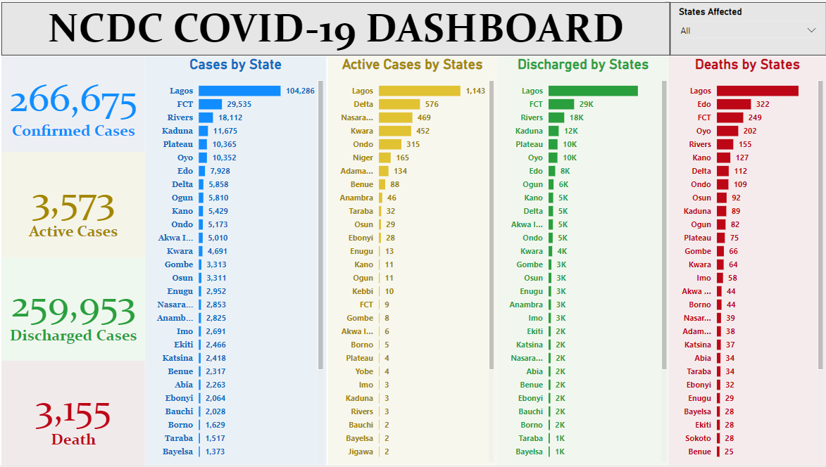
- Confirmed Cases: `266,675` (Total) .
- Active Cases: `3,573` (Total) .
- Discharged Cases: `259,953` (Total) .
- Deaths: `3,155` (Total) .
- Cases by State: Bar chart showing confirmed cases per state (e.g., Lagos 104,286, FCT 29,535, Rivers 18,112) .
- Active Cases by State: Bar chart showing active cases per state (e.g., Lagos 1,143, Delta 576, Nasarawa 469) .
- Discharged by States: Bar chart showing discharged cases per state (e.g., FCT 29K, Rivers 18K, Kaduna 12K) .
- Deaths by States: Bar chart showing deaths per state (e.g., Lagos 322, Edo 249, Oyo 202) .
Key Insights Derived from Data (Pre-Dashboard):
- Lagos as Epicenter: Clearly, Lagos consistently holds the highest numbers across all case categories (Confirmed, Active, Deaths), indicating its status as the primary hotspot.
- Varying Recovery Rates: Different states show varied numbers of discharged cases, suggesting differences in healthcare capacity or recovery patterns.
- Regional Impact: While major cities/states like Lagos and FCT (Abuja) have high confirmed cases, other states have significant active cases or deaths, highlighting the widespread impact of the pandemic across the nation.
- Disparity in Active vs. Confirmed: The relatively low number of active cases compared to confirmed and discharged cases suggests a high recovery rate, which is a positive indicator.
4. Dashboard Design & Key Insights (Based on Visual Analysis)
The project culminated in an interactive Power BI dashboard, the "NCDC COVID-19 DASHBOARD", designed to provide clear, actionable insights into the pandemic's status in Nigeria.
Dashboard Features and Key Insights from the "NCDC COVID-19 DASHBOARD":
4.1 Executive Summary & Key Performance Indicators (KPIs)
The dashboard's left side features prominent KPI cards for immediate, high-level understanding:
- Confirmed Cases: `266,675`
- Active Cases: `3,573`
- Discharged Cases: `259,953`
- Death: `3,155`
These cards provide a snapshot of the pandemic's overall footprint in Nigeria.
4.2 State-Level Case Distribution
The dashboard effectively visualizes the breakdown of cases by state using bar charts, facilitating quick comparisons and identification of areas of concern:
- Cases by State: A bar chart displaying confirmed cases per state, prominently showing Lagos with 104,286 cases, significantly higher than FCT (29,535) and Rivers (18,112). This visual immediately identifies Lagos as the primary affected region.
- Active Cases by State: This chart highlights states with the highest current burden, with Lagos (1,143) and Delta (576) having the most active cases. This is crucial for resource allocation and immediate public health interventions.
- Discharged by States: Shows recovery rates per state, with FCT (29K), Rivers (18K), and Kaduna (12K) leading in discharged cases. This reflects the healthcare system's capacity to manage and treat cases.
- Deaths by States: Displays the tragic impact of the virus, with Lagos (322), Edo (249), and Oyo (202) reporting the highest number of fatalities. This data is essential for understanding mortality trends and informing public health measures.
4.3 Interactive Filtering
- States Affected Slicer: Located in the top right, this slicer allows users to filter the entire dashboard by specific states or view "All" states. This enables a granular exploration of the pandemic's impact on any chosen region.
The dashboard's design ensures that key information is accessible at a glance, allowing public health officials and the general public to monitor the COVID-19 situation effectively across Nigeria. The consistent use of color (blue for confirmed/active, green for discharged, red for deaths) enhances visual clarity.
5. Technical Approach & Tools
I executed this project by following a structured data analysis and business intelligence pipeline:
- Data Acquisition & Ingestion: The project began with grtting of the NCDC COVID-19 data into Power BI Desktop via web
- Data Cleaning & Transformation (Power Query in Power BI): This was a crucial phase to ensure data accuracy and consistency. I utilized Power Query Editor to:
- Handle any missing values, particularly ensuring that numerical case counts were accurate.
- Standardize state names for consistent categorization and visualization.
- Ensure correct data types for all columns.
- Potentially create calculated columns if 'Active Cases' was not directly provided but derived from Confirmed - Discharged - Deaths.
- Perform any necessary aggregation or unpivoting to prepare the data for dashboard presentation.
- Data Modeling (Power BI Desktop): A straightforward data model was established, as the dataset appears to be a single fact table. (If a date dimension was also used, a relationship would be created). The model was optimized for the specific calculations and visualizations required.
- DAX (Data Analysis Expressions) Calculations: I wrote DAX measures to calculate the key performance indicators (KPIs) and aggregations displayed, such as:
- `Total Confirmed Cases = SUM('Table'[Confirmed])`
- `Total Active Cases = SUM('Table'[Active])`
- `Total Discharged Cases = SUM('Table'[Discharged])`
- `Total Deaths = SUM('Table'[Deaths])`
- Measures for counting cases by state to populate the bar charts.
- Data Visualization & Dashboarding (Power BI Desktop): I meticulously designed the interactive dashboard using appropriate visualization types:
- KPI Cards: Used for the prominent display of total Confirmed, Active, Discharged, and Death cases .
- Bar Charts: Effectively used to show the distribution of each case type across states, allowing for easy comparison of state-level impact .
- Slicer: Implemented a "States Affected" slicer to provide interactivity, allowing users to filter data for specific regions .
- Color-Coding: Applied consistent color-coding (e.g., green for discharged, red for deaths) to intuitively represent different case categories.
- Publishing & Sharing (Power BI Service): The final interactive report was published to the Power BI Service, enabling secure sharing and access for public health officials and the public.
6. Impact & Business Value
This NCDC COVID-19 Dashboard project delivers significant value to various stakeholders involved in public health and crisis management:
- Enhanced Public Awareness: Provides the general public with clear, easy-to-understand data on the pandemic's status in Nigeria, fostering informed behavior and reducing misinformation.
- Informed Policy Making: Enables public health authorities, like the NCDC, to quickly assess the spread, active caseloads, and mortality rates across states, facilitating data-driven decisions on interventions, lockdowns, and resource allocation.
- Operational Monitoring: Health administrators can monitor the capacity of healthcare systems by tracking discharged cases and understanding the burden of active cases in specific regions.
- Resource Allocation: Identifying states with high active cases or deaths can guide the deployment of medical supplies, personnel, and vaccination campaigns to areas most in need.
- Trend Identification: While not directly shown in the provided static image, the dashboard's underlying data model allows for time-series analysis (if historical data is available), which can help identify trends in infection rates, recovery, and mortality over time.
- Demonstrated Data Literacy: The project showcases the ability to handle sensitive public health data responsibly, transform it into clear visuals, and communicate complex information effectively.
7. Conclusion
This NCDC COVID-19 Dashboard project successfully transformed raw public health data into a critical tool for monitoring the pandemic's impact across Nigeria. By meticulously processing the data and designing an intuitive Power BI dashboard, I was able to provide clear insights into Confirmed, Active, Discharged, and Death cases at a state level. The dashboard serves as an invaluable resource for public awareness and supports public health officials in making data-driven decisions, highlighting the profound impact that effective data analysis and visualization can have during a health crisis.